Validate like a Native with React
Validating a form doesn’t always require a lot of code. With HTML5 constraint validation, you can describe form validation rules with HTML attributes on the form fields.
For example, to enforce that an <input> element should not be empty, add the required attribute to the element:
<input id="name" name="name" required/>
You can use HTML5 constraint validation even with React. Let’s look at an example.
Pseudo-classes to the rescue
We’ll focus on an <input> field the user needs to fill. After the user presses the Submit button, we want to highlight the empty field and show a message containing the validation error below it.
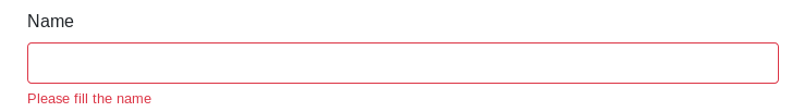
To limit the amount of JavaScript code to a minimum, we’ll steal a few techniques from Bootstrap to highlight errors and display messages with CSS.
The browser can generate error messages automatically but you can’t change their look, so we’ll disable them with the novalidate attribute on the <form> element:
<form noValidate>
</form>
The browser won’t show any error messages, but it will validate the data and add :valid and :invalid pseudo-classes to the inputs.
We’ll use these pseudo-classes to highlight the fields that contain errors and display our own error messages.
Dive in the components
If we styled the :invalid pseudo-class directly, the input field would be highlighted before the user has finished typing. To avoid premature error highlighting, the Bootstrap CSS adds a red border to invalid input fields with the .form-control class only when a parent element has the .was-validated class.
.was-validated .form-control:invalid {
  border-color: #dc3545;
}
We can control when the error highlighting appears by toggling the .was-validated class on the form component.
Let’s create a Form component with a validated prop. When validated is true, add the .was-validated class to the <form> element.
function Form({ validated, innerRef, children, ...otherProps }) {
 const formClasses = classNames({
   'was-validated': validated,
   'needs-validation': !validated
 });

 return (
   <form noValidate className={formClasses} ref={innerRef} {...otherProps}>
     {children}
   </form>
 );
}
To display the <input> field, use a React presentational component that creates an <input> element with a label and the .form-control class.
export default function Input({ label, ...inputProps }) {
  return (
    <React.Fragment>
      <label htmlFor={inputProps.id}>{label}</label>
      <input className="form-control" {...inputProps} />
    </React.Fragment>
  );
}
Presentational components like this one avoid repetition without obscuring the application logic.
Let’s move on to the error messages. We don’t want to show error messages until the user has tried to submit.
Elements with the .invalid-feedback class are set to display: none by default:
.invalid-feedback {
  display: none;
  width: 100%;
  margin-top: 0.25rem;
  font-size: 80%;
  color: #dc3545;
}
The .invalid-feedback elements gets displayed when a sibling has the :invalid pseudo class and a parent element has the .was-validated class:
.was-validated .form-control:invalid ~ .invalid-feedback {
  display: block;
}
If you add the .invalid-feedback class to a <div>, the <div> will show only when next to an input field which contains errors:
export default function Feedback({ children }) {
  return <div className="invalid-feedback">{children}</div>;
}
Our styles and markup are ready, now let’s see how to activate the error highlighting and the error mesages.
Red Alert
To highlight all errors after the user attempts to submit, we’ll listen to the submit event and toggle the .was-validated class on the <form> element.
We want to keep validation logic outside the form presentational components, in a component called App. App will have a single state variable, validated, initialized to false:
class App extends React.Component {
  state = {
    validated: false
  };
}
In App’s render() function, pass state.validated as the validated prop to Form:
render() {
  return (
    <Form
      validated={this.state.validated}
    >
      <Input required />
    </Form>
  );
}
Errors will be highlighted when this.state.validated becomes true. We want to wait until the user submits the form to toggle this.state.validated, so let’s dive into the submission logic.
Ready to submit!
When the user presses the submit button, we’ll switch this.state.validated to true. In the App component, create an event handler for the submit event.
class App extends React.Component {
  submit = event => {
    if (/* form is invalid */) {
      event.preventDefault();
      this.setState(() => { validated: true });
   }
  };
We check if the form is valid; if it’s not, we highlight the errors, else we proceed with normal submission.
To check whether the form is valid, you could store a reference to the form DOM node and call checkValidity().
event.preventDefault() prevents the form from submitting immediately.
Then bind the event listener to the submit event on the form.
render() {
  return (
    <Form
      onSubmit={this.submit}
      validated={this.state.validated}
    >
      <Input required />
    </Form>
  );
}
If the user corrects the errors, the error messages disappear as the browser removes the :invalid pseudo-class from the input fields.
Do we need custom validation after all?
We’ve manages to display validation errors by toggling just one CSS class, but we could improve the user experience.
It would be better to highlight the error as soon as the user leaves the field, but to achieve that we would need to track state on a per field basis, so either make each input field stateful, wrap it in a stateful component or store whether the user has visited each field in the main app state.
This kind of code is quite repetitive and verbose, so I prefer to use a dedicated solution like final-form.
Another issue comes up if you want to use the same validation logic on the server. The HTML5 constraints API buries the validation rules in the markup.
Further reading
For learning React fundamentals, try React for Real ;-).
The components ended up looking a lot like Reactstrap, which is nicd if you want some React components with the Bootstrap CSS classes already applied.